Super excited to share these Midjourney AI prompt-generated portfolio website templates. They feature surprisingly unique color schemes, patterns, and themes that resemble even professional designs. The level of detail and "thought" put into each template is really impressive. The color palette is carefully selected to complement the overall design, making the templates visually striking and eye-catching. The patterns and themes are unique and original, but at the same time, they work seamlessly with the rest of the design. The result is a cohesive and polished website that will leave a lasting impression on visitors. Take a look and hope you are inspired by the amazing works below.
By the way, something that really shocks me about this is that Midjourney is able to put so much character into these portfolios as if they were a real person and it makes me feel both scared and also wildly optimistic about the future of this tech.
A bright yellow page that demands your attention
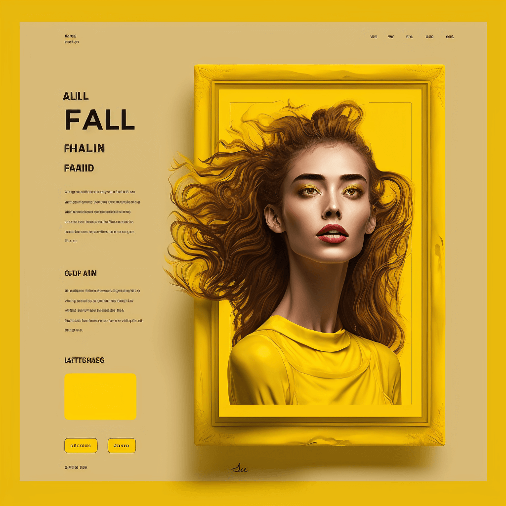
A portfolio website template with a yellow color scheme. This piece has a great use of type and space. All elements are neatly organized in a way that's easy to navigate but also visually striking. The type matches the style as well as the font-size decisions used. The header bar dissolves seamlessly with the rest of the page. The illustration, which could be the page's owner, literally pops out of the frame to demand your attention. There's even a signature on the bottom symbolizing the artist's touch. However, there are some faults. The neck is slightly elongated in the rendering and the big yellow box on the bottom left is questionable. But overall, I was very amazed at this piece.
This page invites you into a their personal cozy room
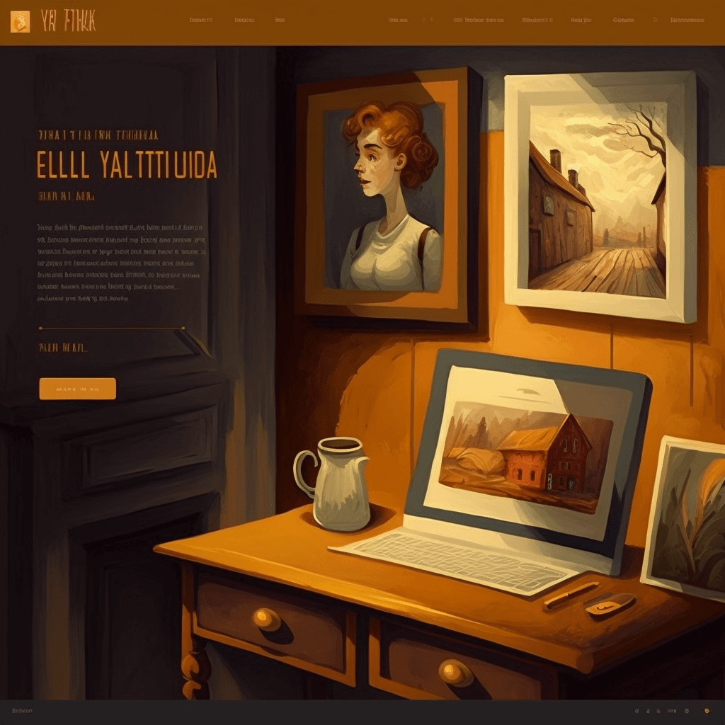
A portfolio website with a warm color scheme. This was my favorite piece in this series. With this page, the artist invites you into their space where you learn so much about this person. Hanging on the walls are their pieces, naturally arranged as if you were in a physical space. A portrait of the artist also is in view so you know who's the owner. It's not eye-catching but also not too subtle. This page also features a header bar and stylistic type on the left. There is an imperfection: the computer is not rendered correctly. But the overall concept of this page was very cool to me. Great use of warm colors as well.
Chinese and Asian themes
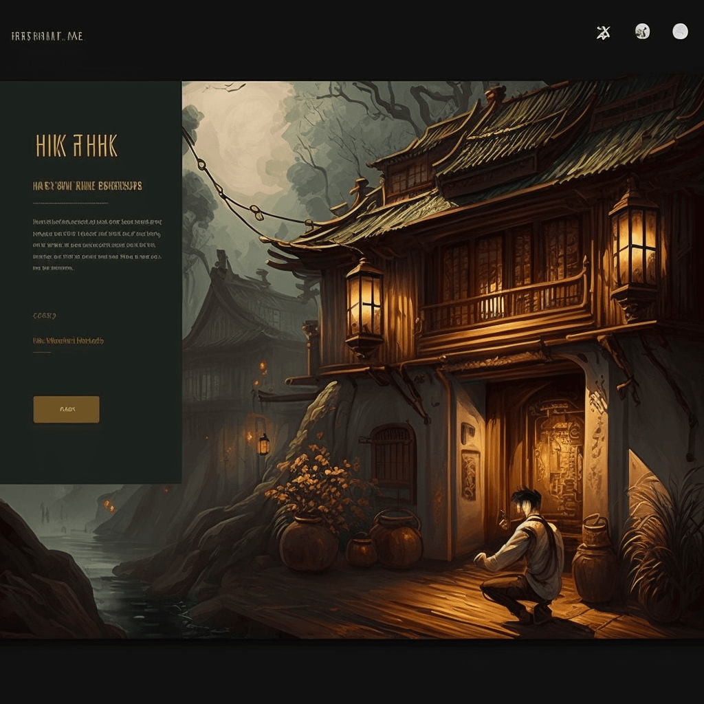
This page brings you to another country. A lone individual (the portfolio owner) sits in front of a stylistically architected building smoking a pipe and in contemplation. You can tell a lot about this person from this piece as well as their method of design. The illustration on this page features exemplary use of lighting and color. This page features a simple easy-to-read header bar and nicely composed typing that meshes well with the overall style of the individual.
A portfolio site as if you were in a physical museum space
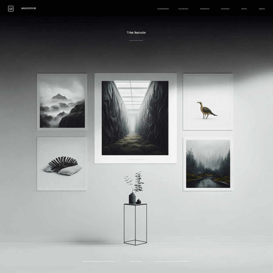
TThis is a piece that I really like because of its use of color, its simplicity, and the creative thought that went into it. When you first open this page, you'll definitely feel like you're in a museum or gallery. The colors are very cold, but so are the pieces that the artist is showing. It features a gradient that goes from black to white, with a distinct header situated on top of everything. The font size is small, which forces you to lean in to really catch what it's saying. I found it funny that there's a floor there and on that floor is the footer of the page. Overall, it's a really cool, simple design with no obvious flaws.
A big full scale background for a big world
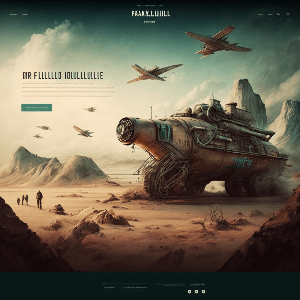
This portfolio page is for an individual who thinks big and in effect needs a full scale point-to-point illustration piece. The colors on this piece work well and remind you of a another planet. The type is masterfully organized so that it's easy to navigate yet doesn't compromise the power of this illustration. The font sizing is perfect, making an impact as soon as you land on this page, while it forces you to lean in to learn more. Some faults of the rendering include the airplanes but that could be easily fixed in the future versions of Midjourney.
Japanese themes
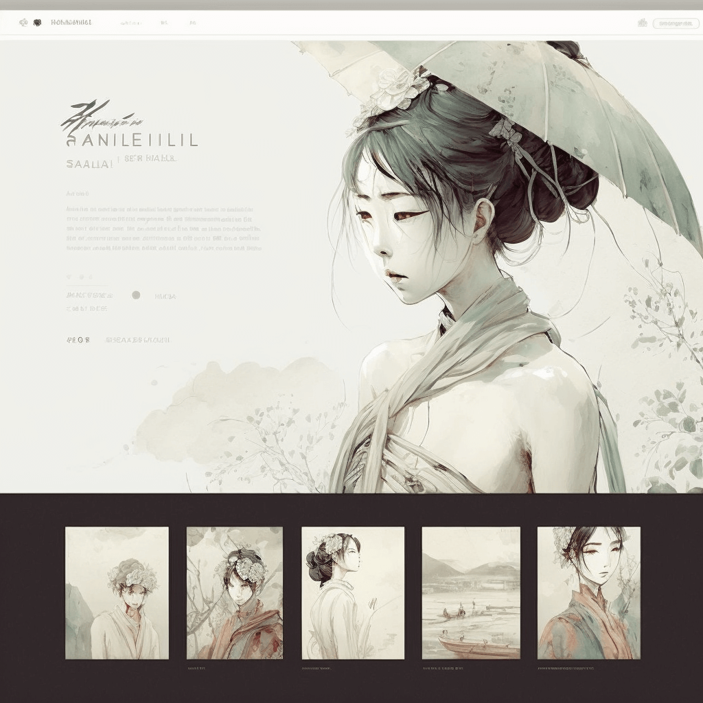
This is a page that appears deceitfully simple, but is not easy to create. The elements of this page are arranged so carefully that all of the information can be fit within a single page. This is masterfully done and hard to accomplish even for a professional. The font and colors used in this composition are delicate. Everything fits so well with the prompt, which was to create a Japanese-themed portfolio page. The only imperfection I noticed was the umbrella on top of the woman's head, but that was only noticed upon close inspection.
Straight-forward photography
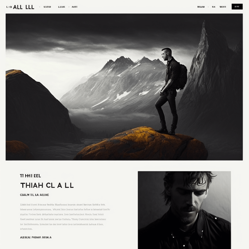
This is a nice photography-related portfolio page. Not too many colors are used; it's very simple, elegant, and clean. There's a distinct header, main image, biography, and portrait, with type that matches the overall aesthetic of the page. There is absolutely nothing glaringly wrong about this page, which speaks to how advanced this technology is.
Illustrative story telling
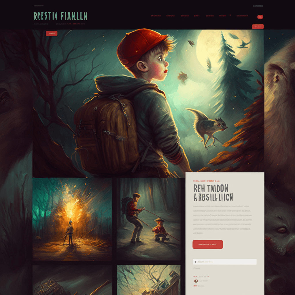
This page is very interesting. It's a little rougher than the other portfolio renderings that are on this showcase, but I had to include it because of the unique illustration style. It goes straight to illustrations and it almost feels like it's telling a story through the pictures that seem carefully arranged. On the bottom right, there is a brief biography and what looks like a sign-up form for contact. There's a distinct header with colors matching the illustrations that are on display. The background of the page is also a vague illustration. Like I said, this is a rougher rendering than the others, but I feel it is still worth mentioning on this showcase.
Stylistic
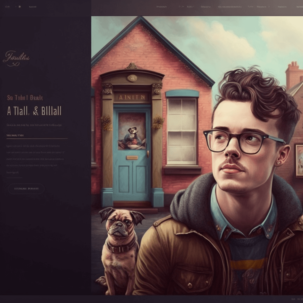
This page is divided into two sections, similar to how I arranged this website. The left side has information about the artist, while the right side shows a drawing of what the artist thinks represents himself. The illustration is definitely stylistic, featuring colorful houses, a dog, and the subject of the portfolio page himself. You can definitely tell a lot about what the owner represents and stands for through this page. One thing that I feel is off about this rendering is the header, but other than that, it's a great template and inspiration for anyone trying to create their own portfolio page.
Dark, moody, cinematic
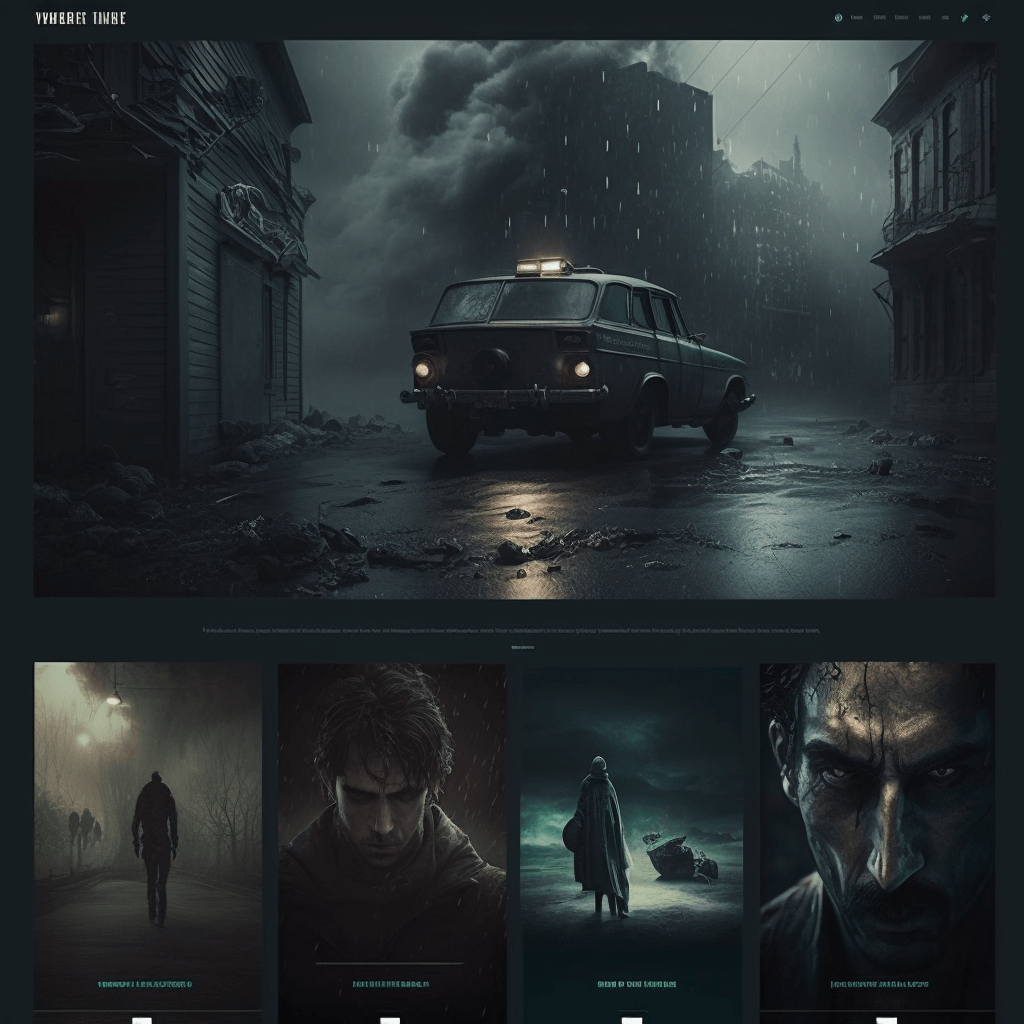
This page is definitely on the darker side and has very serious undertones. Whoever this page is representing is obviously a filmmaker who specializes in darker pieces. There's a header, a billboard, and four different posters, which I think you can click on to browse more sections of this website. Overall, it's a really cool rendering.
Round features, like a rotary phone
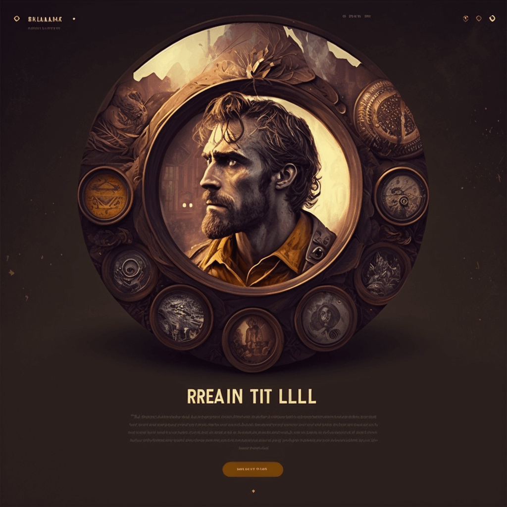
Although this page is more on the basic side I still wanted to include it because I thought it was unique. When I first saw this page it reminded me of a rotary phone. Although the rendering is a little rough it would have been a great idea for each of those numbers to have been a piece this page is trying to show off. The sepia colors all blend together and works nicely and at the bottom is a blurb and a button which you can click to navigate to a gallery section of the website.
Simple and bright
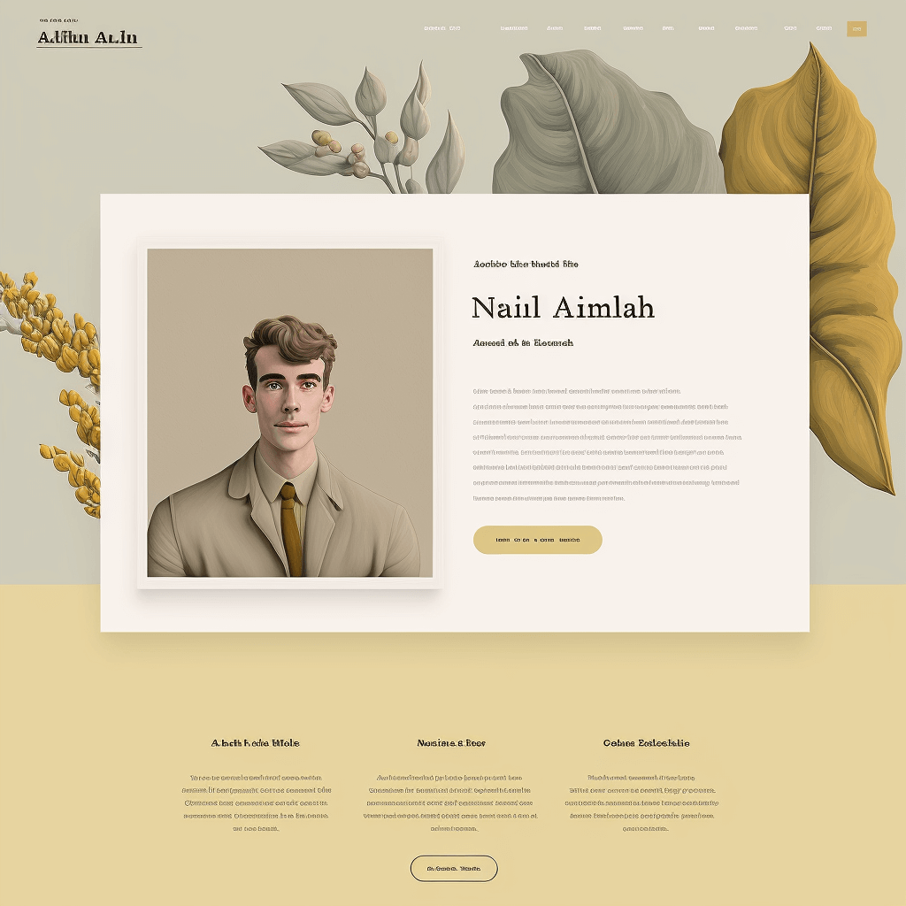
This is a really simple and elegant design, and immediately, you can tell a lot about the person this page represents. There's great use of colors that are neither too cold nor too warm, a simple business card-like dialogue with a professional portrait, his name in big type, a description, and a button to visit the gallery section of the website. The footer is a little bit off, as it seems more like a product-type composition, but regardless, I really liked this simple design. Especially with the different pieces of vegetation in the background, it makes this page very calming, if that makes sense.
Monochromatic creative
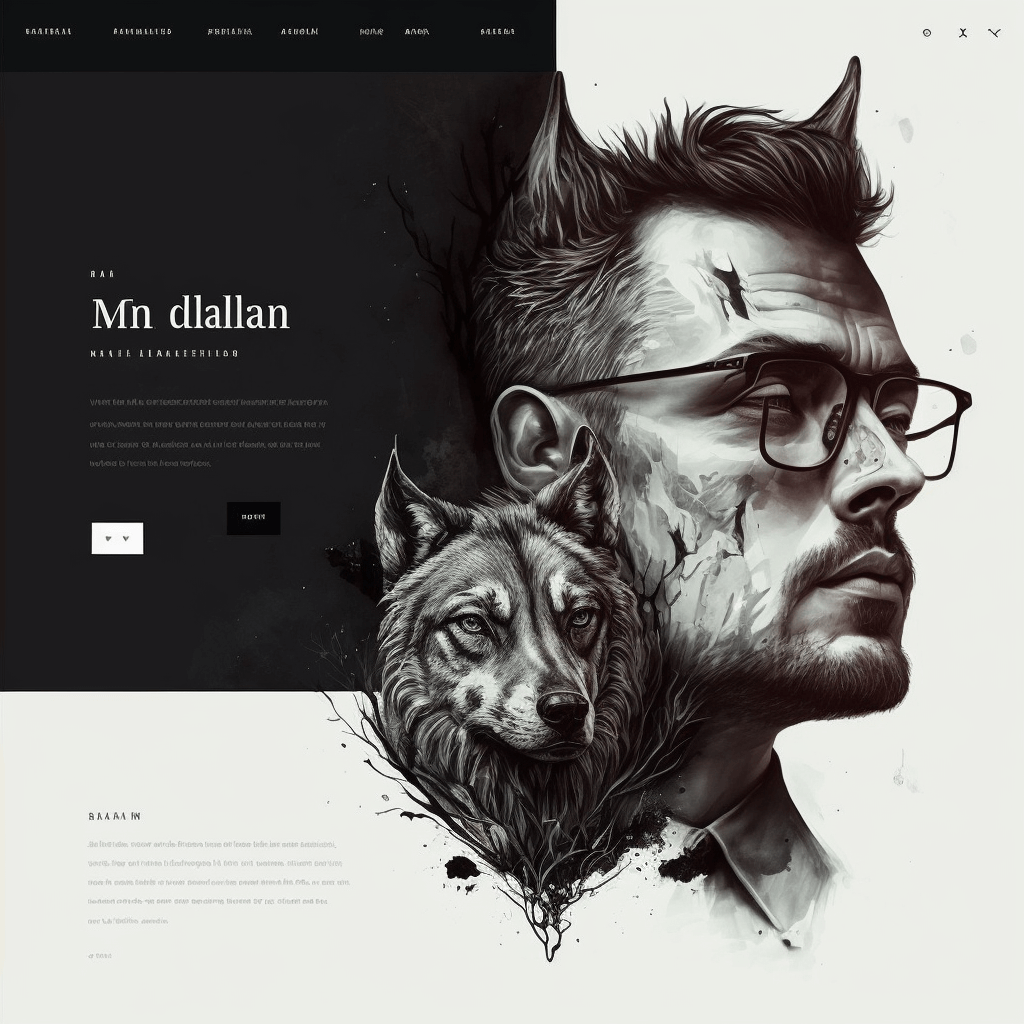
Finally, I added this piece as a sort of wild card to showcase what Midjourney is truly capable of. It's a very rough illustration but it has a lot of unique concepts. Talking more about the image itself, you can see that the man and animal are sort of combined, which I thought was very interesting. Specifically, the hairstyle of the man matches the outline of the wolf. This is a page that's divided into two, with the left side containing information about this person. The illustration is in the forefront, while the website elements are placed behind it, as if to say that the art is more important than the website itself. Truly a cool piece.
I truly appreciate that you reached the end. Here are some products that I recommend as a web developer. I only recommend high quality products:
• Bose Noise Cancelling Headphones 700 - The best noise cancelling headsets rated by NYTimes to keep you in the zone.
• Don't Make Me Think by Steve Krug - One of the best-loved and most recommended books on UI development, every web developer must have one.
• Keychron Q3 Mechanical Keyboard - A brand that makes reliable, ergonomic, efficient keyboards. Perfect for all-day coding.
• Herman Miller Aeron - The best chair in the world. A good chair is one of the most important things for who works on the computer.
• Wacom Intuos Pro Drawing Tablet - A professional, precise drawing tablet for your designs.
If you'd like your own custom portfolio concept or have something fully implemented, please reach out to me at my personal Discord below. I am a full-stack web developer with deep background knowledge who can help bring you amazing solutions for your brand growth.
---